Mission
Help Kidjo.inc to rebrand their children app, from Art Direction to UI Design.

CLIENT

Kidjo.inc

TYPE

iOS app + Web

ROLE

Art Direction - UI

I’m a designer but I’m also a dad with 2 little daughters that sometimes want to watch cartoons. I’m not kind of screens for children but I allow few minutes here and there… I whish I could let my children alone on Youtube but that’s unfortunately not possible. I have 3 issues: the ads, the lack of control over content (a 4 y.o child click everywhere on the screen), the Youtube U.I which is not designed to be used by young kids alone.


As I would pay for such a product, I’ve already checked up on the Appstore for an app that answers these issues but didn’t find something really efficient among existing apps like Youtube kids, Hopster, Netflix, Playkids and... Kidjo.


When I’ve received a mail from the Kidjo team to ask me if I could help them to redesign their product from scratch I was very exited because I really thought I could do something and I knew my own kids would be glad to test such a product.


This adventure started in August 2016, I was in charge of the Art Direction and the User Interface design of the product, while collaborating with Johan Adda, former Apple UX.
CHAP 1.0

About the product

Kidjo is an iOS app mainly designed for 3 to 7 y.o kids, but also for the parents. Here is a list of the main core features of the product:
Kids features

  • Watch cartoons and learning videos
  • Use the app alone
  • Save video locally

Parents features

  • Set up to 3 kids profiles
  • Define a max. time watch limit
  • Content feed customization

CHAP 2.0

Product identity

It was the first time I had to design for 3 to 7 y.o humans and let me tell you that it’s not as simple as I thought because there are LOTS of design constraints. My first mission was to rethink the product identity. The project was split into 2 distinctive parts. Even if young kids are the main users, all the setting part is dedicated to their parents (mostly women).

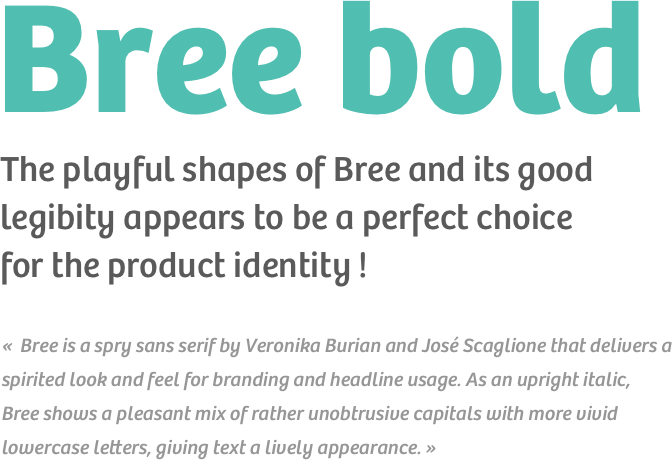
I’ve used tools like Niice to create and share mood boards, then Photoshop and Sketch to create some early mockups to set up the right color palette and font. During my researches, I’ve found some interesting things in the book « Design for kids » by Debra Levin Gelman. Now, let me explain how I’ve organized my design process.

product-identity-fullproduct-identity-full

Designing for kids, what does it mean ?

  • Young kids don't see the difference between low contrasted colors

    >> Only use highly contrasted colors

  • Most 3 to 7 years old kids don't know how to read yet

    >> Never use text only, prefer images to convey information

  • They don't understand the concept of hierarchy

    >> Find a UX trick to sort and display content


  • Their attention could only be focus on one thing only

    >> Reduce UI noize and use a limited number of screen interactions

  • They don't understand abstract thinking before 4 years old

    >> Use very simple icons and interactions

  • Kids like to play !

    >> Think about some playful ways to present content: colors, shapes and animations


After many searches and iterations, I’ve finally come up with a palette of 6 highly contrasted and recognizable colors (AA contrast level in WCAG 2.0) to make the differentiation of each license folder easier for the young users of the app. I’ve also crafted each UI elements with soft rounded playful shapes. 

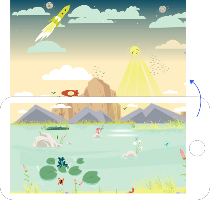
In order to add a more playful   look’n feel to the app, we’ve worked with Caroline Attia, a french illustrator who has created nice illustrations for the background of the app, and few custom characters for sound cards.

Note: we even push the detail further by adding a night background mode if you use the app in the evening <3

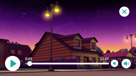
FIG. #1   THE BACKGROUND SWITCH TO THE TOP WHEN YOU OPEN THE BACKPACK MODE TO WATCH VIDEOS WITHOUT NETWORK

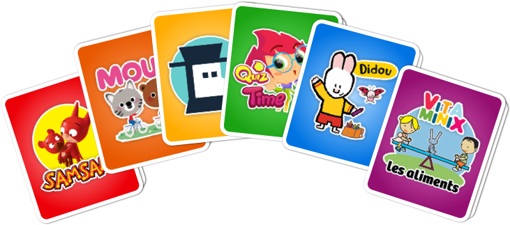
FIG. #2   CUSTOM ILLUSTRATIONS BY CAROLINE ATTIA

CHAP 2.0

About the UX

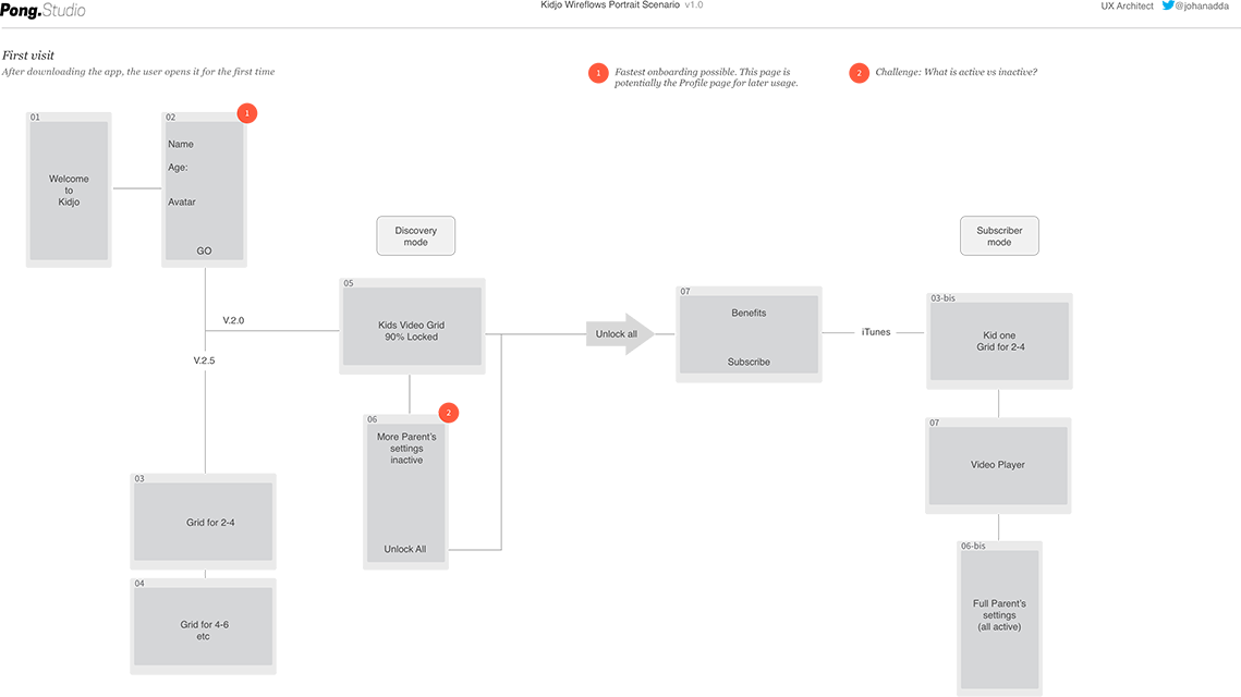
Throughout the mission I’ve collaborated with Johan Adda, former Apple, now freelance UX Architect. He has provided me UX material like wireframes and user flows. That mission had lots of UX challenges as our young main users don’t know how to read yet and don’t understand content hierarchy upon to one level. More of that, the app has to be used on any kind of device from mobile to tablet.

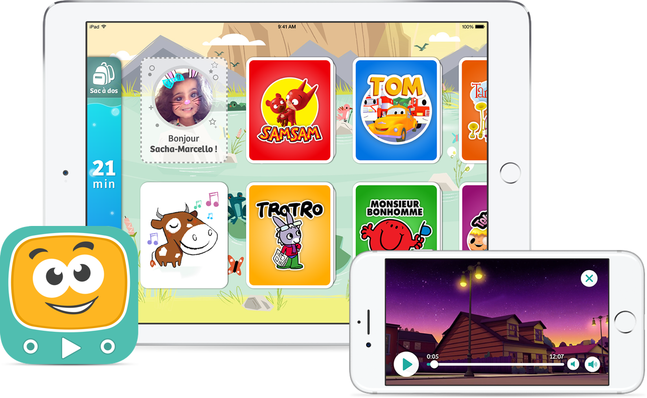
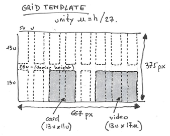
After redefining the user needs, my UX colleague has created a clever grid system without unit, only relative to the screen size in order to be ready for any kind of devices. He has also thought about an app without any navigation system, no text for kids and almost no icons. Just a scrollable content feed with cards to display cartoon licences and a full screen video player to watch them.

FIG. #3   KIDJO WIREFLOWS

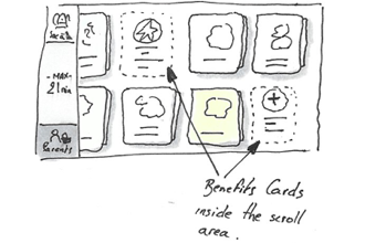
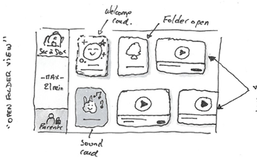
Before starting to work on the UI, I like to go deep into the UX part in order to have a good understanding of the features, information architecture and user flows of the product I’m working on. Based on that UX material, I’ve done lots of sketches with my good ol’ paper and pencils to quickly test and organize my ideas.

FIG. #4   FEW PERSONAL EARLY SKETCHES TO UNDERSTAND THE GRID AND INFORMATION ARCHITECTURE

FIG. #5   FEW PERSONAL EARLY SKETCHES TO UNDERSTAND THE GRID AND INFORMATION ARCHITECTURE

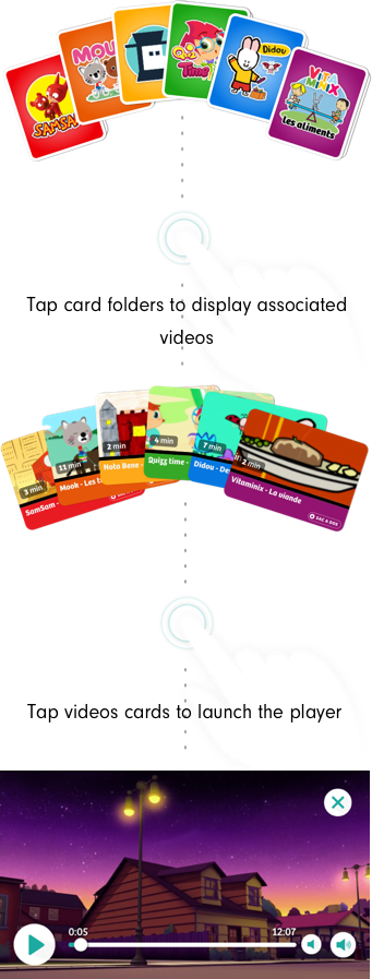
Even if we have to manage a way for the parents to display the setting part of the app without causing to much noize for the kids experience, I want to present you how simple kidjo is for kids:

Tap card folders to display associated videos

Tap video cards to launch the player

... and...Voilà !

cards-ux-mobilecards-ux-mobile

As you may know, it’s hard to build seamless user experience, even harder when you target a very young audience. Achieving such a simple user flow took lots of time and we’ve gone throught many rounds of iteration.

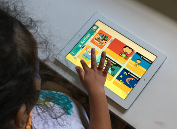
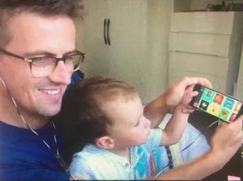
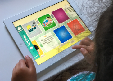
I’ve used Sketch and Invision in order to quickly iterate and test our ideas into multiple prototypes. Invision is perfect to experience the design work in real context (on my phone) and share a test url for the team. I was also able to make my older daughter try few of the early versions of the app in order to see how she experienced the product.

FIG #6. PERSONAL TESTS OF FEW EARLY PROTOTYPES AT HOME WITH OUR KIDS

CHAP 3.0

Kidjo's User Interface design

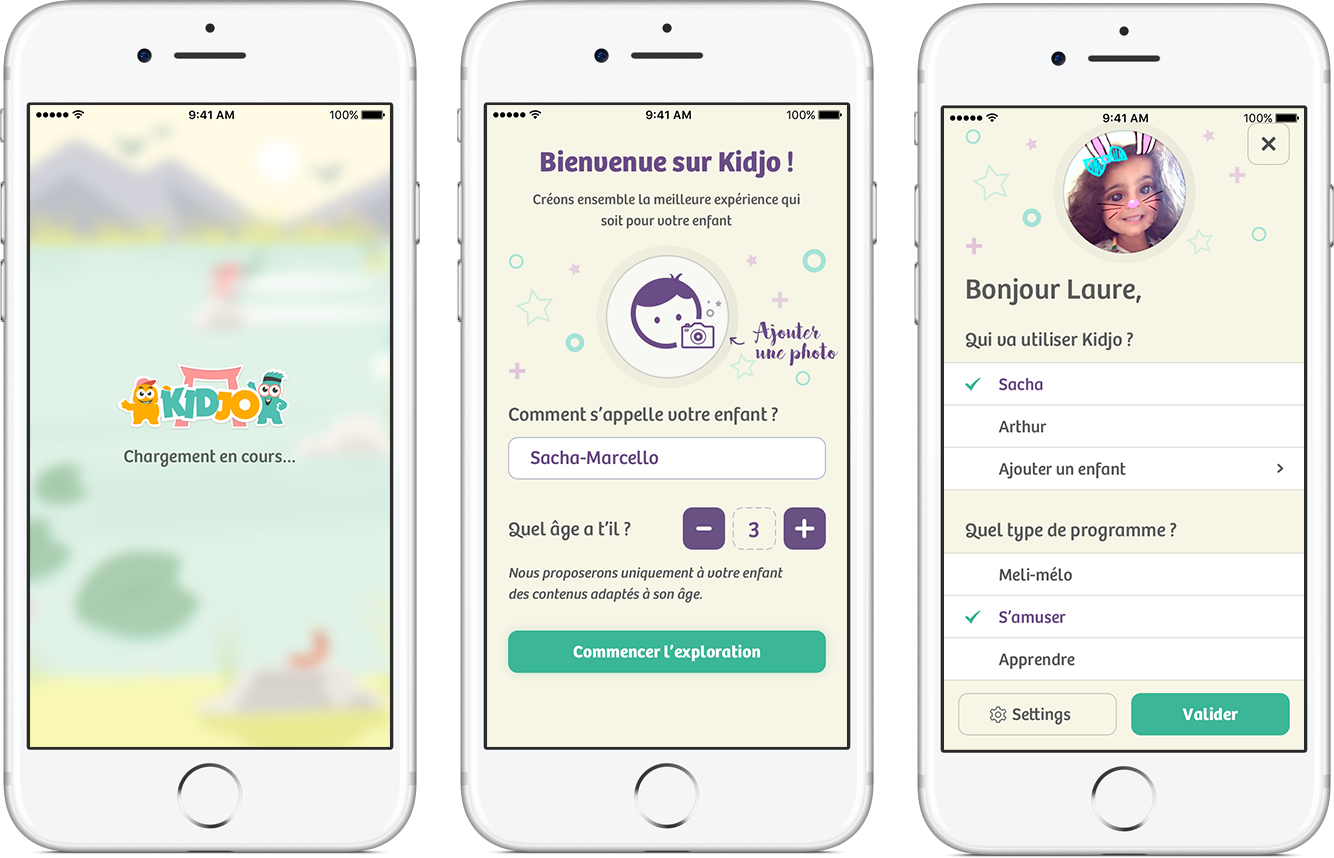
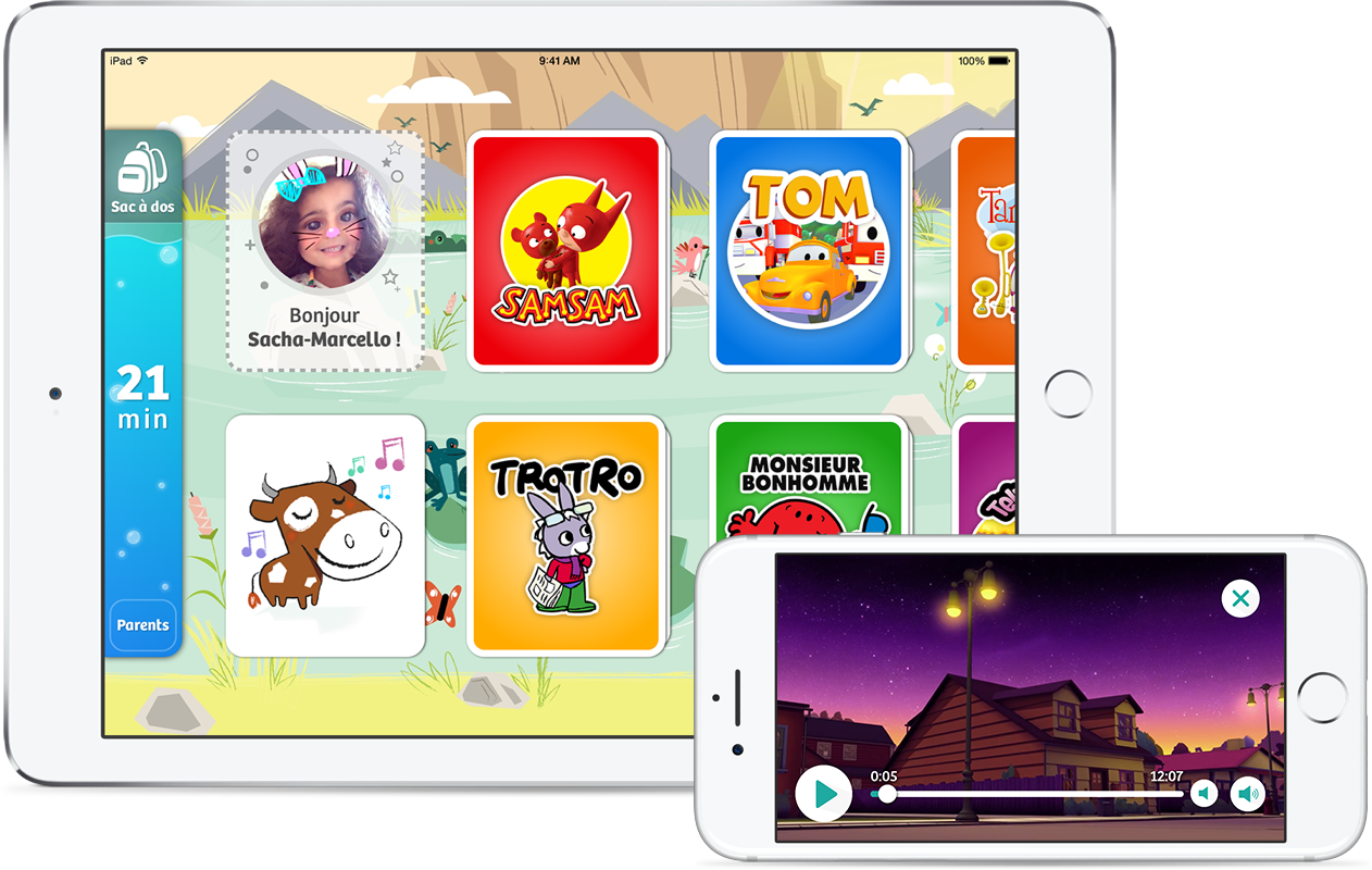
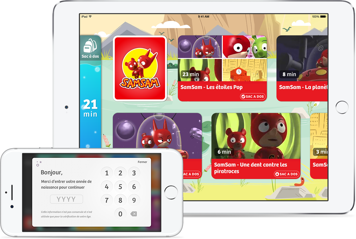
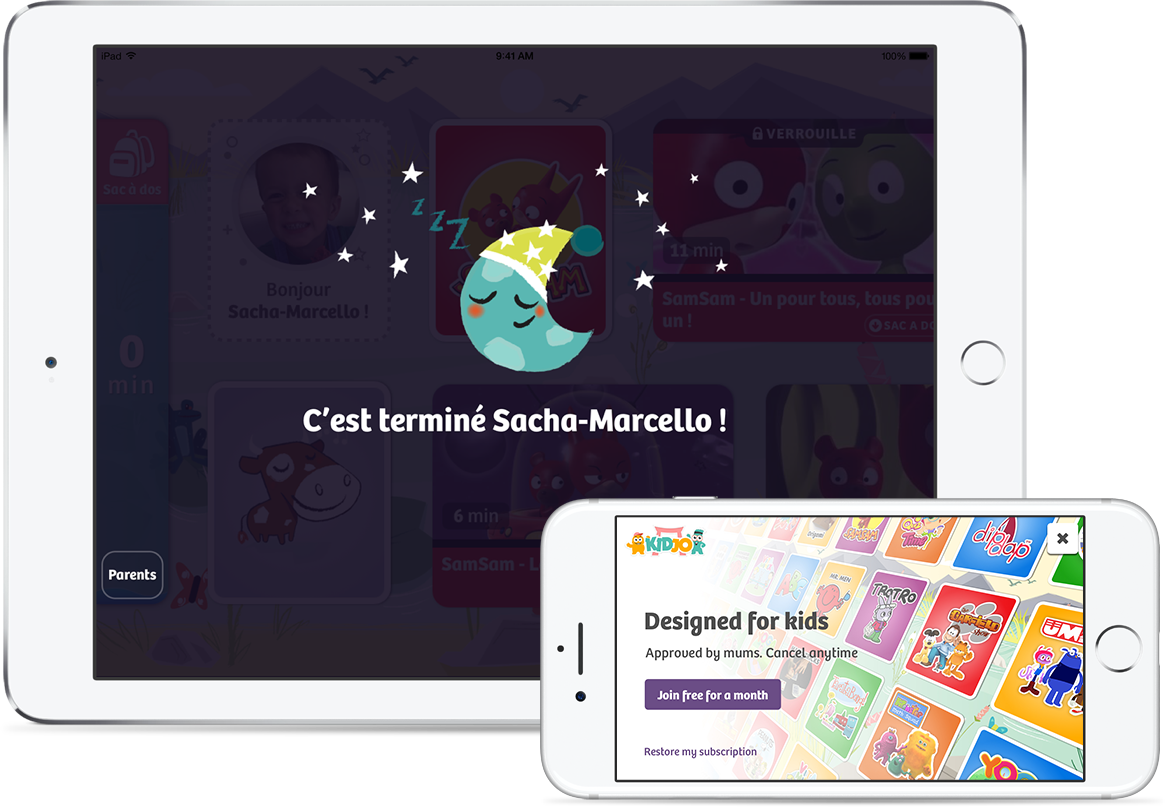
Here is a presentation of some of the iOS app screens I’ve done for mobile and tablet. The Kidjo app is divided into 2 distinctive parts: the main navigation dedicated for 3 to 7 y.o kids in landscape mode, and the parent’s settings area in portrait mode. The parent button displays a parental gate to open the app settings.

FIG. #7   LOADING AND SETTING SCREENS

ui-img-1ui-img-1

FIG. #8   TABLET CONTENT FEED LAYOUT AND MOBILE FULL SCREEN VIDEO PLAYER

ui-img-2ui-img-2

FIG. #9   PARENTAL GATE (MOBILE) AND VIDEO CARDS ASSOCIATED TO A LICENSE (TABLET

ui-img-3ui-img-3

FIG. #10   SCREEN DISPLAYING AFTER REACHING THE TIME LIMIT (TABLET) AND SUBSCRIPTION MODAL (MOBILE)

CHAP 5.0

Kidjo's public communication assets

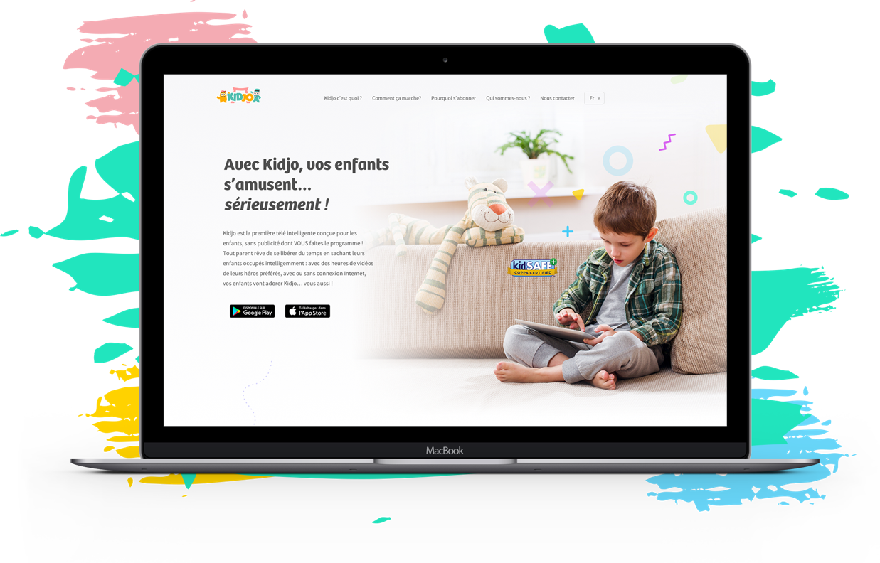
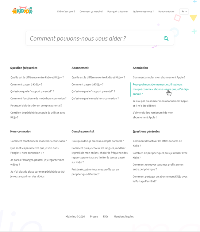
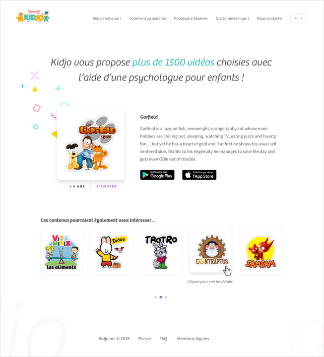
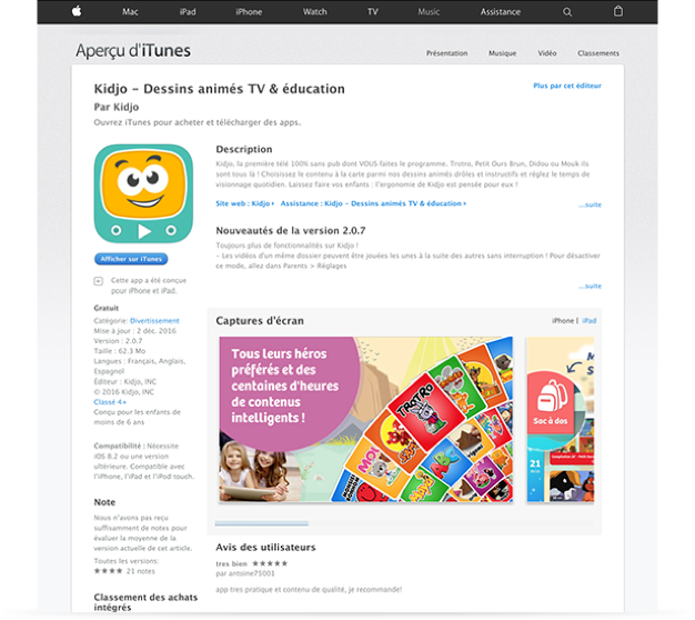
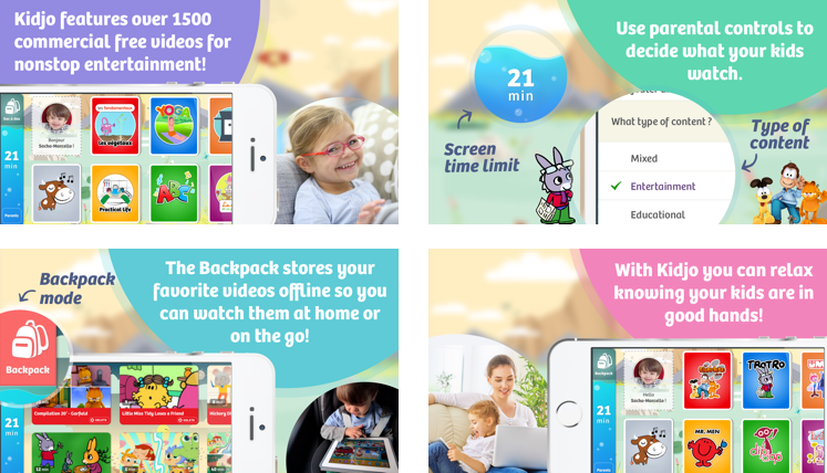
Beside the app itself, I’ve also help the Kidjo team to design all the public communication assets related to the project: kidjo’s website, appstore screens, emailing, and even a keynote product presentation.

_Kidjo's website

FIG. #11   FULL HEIGHT HOMEPAGE (DESKTOP)

_Other assets

FIG. #15   KIDJO'S APPSTORE SCREENS

CHAP 6.0

Design results 
after public release

Thanks to the data, we _ as designers_ could have a direct feedback of our work. Design is just a tool to create a better experience for users which logically lead to increase product sells. After few months, I could proudly say that the work we’ve done on that new product version hits +200% sales on iOS and get some pretty good feedbacks on mass media (TV show, press etc.).

UPDATE Jan 2017: Kidjo has been featured on the AppStore! 

It has been a pleasure to work with Aurélien over the last few months, he has shown himself to be very available, strong in his proposal and has imposed his personal touch. Thanks to his help and advice, our KPI have all been multiplied by two or three in some cases since the redesign of the app.

Martin Poix - CEO Kidjo.inc