Mission
Designing a real-time analytics and optimization technology platform for ad publishers.

Adomik is a French startup who empowers publishers, marketplaces, and media buyers to optimize programmatic advertising. I’ve worked with them to rebrand their existing service but also to design new features to the existing app which was open to beta testers. I’ve worked on Art Direction, Information Architecture, UX and UI for their web app and public website.

As I wasn’t familiar with the world of advertising and even less with marketplaces technical vocabulary, I’ve first spent some time to discover this new environment: the market, the product itself, the main competitors, etc. We’ve done lots of calls, I’ve read a bunch of technical docs, but I’ve also worked directly from the Adomik office in Paris to be closer to the team.

Note: Due to NDA constraints I, unfortunately, can't show the work I’ve done for the app so I will only focus on few aspects of the project (overall visual design, public website, etc.) and my global approach.

CHAP 1.0

Building a
new identity

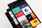
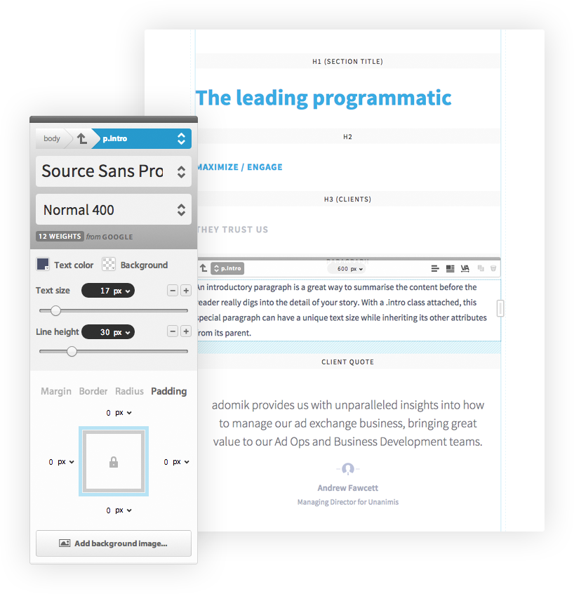
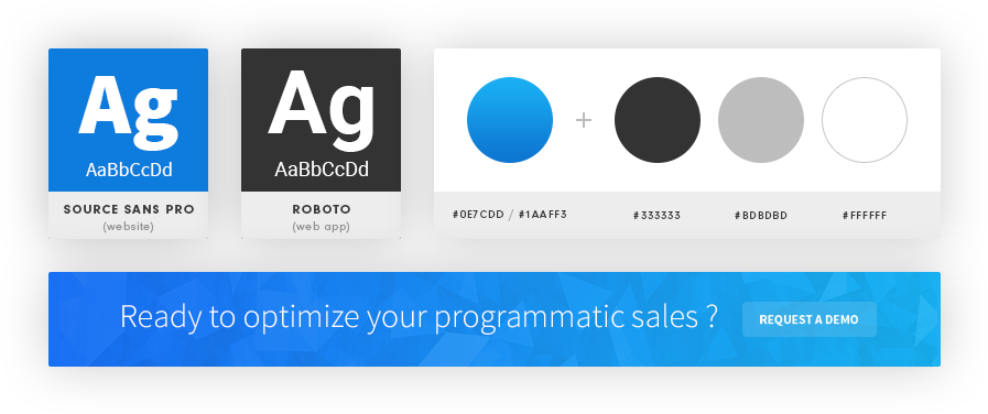
My first work was to reshape the identity of the existing product. I've used some tools to help me building the design system. As an example, I've used Typecast to set up the typography through consistent vertical rhythm that relayed on a baseline grid and hierarchical font-size and styles. I've also worked on the company tone. I wanted to create a voice that would represent the Adomik team as solid technical partners, very close and listening to their clients which couldn't be much true (that's the power of human-size startups). The look'n feel of the app had to be technical but also human-centered. With those elements in mind, I've chosen the type, colors and icons to be focus on our goal.

FIG #1. TYPECAST IS A GREAT TOOL TO SET-UP THE TYPOGRAPHY

FIG #2. PART. OF THE ADOMIK VISUAL LANGUAGE

CHAP 2.0

Designing web app components

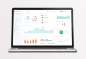
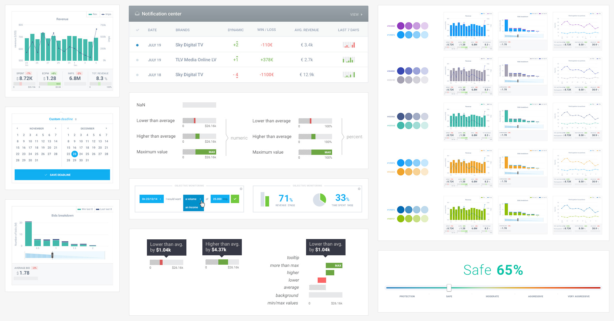
This was by far the principal part of my work. Even if I can't show you everything, I can try to explain what it consisted in. I've worked closely with engineers to design new app features. As I wasn't entirely comfortable with the advertising marketplaces technical field, the communication was a critical part of the job. I've worked closely with engineers teams to understand the ins and outs of each app feature correctly. Most of those depended on of beta tester feedback, so it was very convenient to rely on real data for the design work.

My approach was almost always the same: I've never hesitated to ask lots of questions to the engineers about each feature, then I've designed quick mockups and iterate with the teams until we find a substantial design issue. After that, I could design the final UI module and ship it. After few weeks, we could sometimes iterate thanks to users feedbacks again. 

This was definitely the best part of the mission. I’ve loved to collaborate with engineers and think about the most efficient ways to presents data and design new app features.

UI-Modules-large

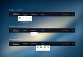
FIG #3. SOME WEB APP UI COMPONENTS 

CHAP 3.0

The company website

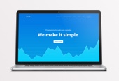
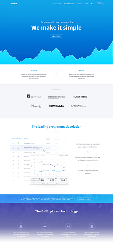
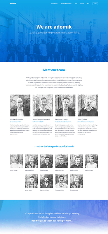
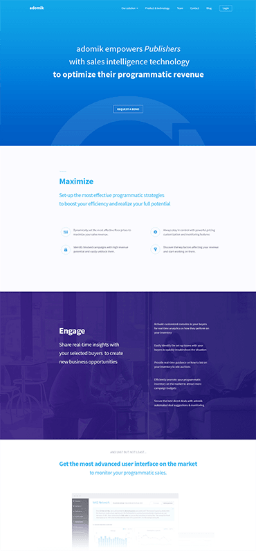
Beside the work on the app I’ve designed the new website of the company, based on the new identity. As we started from scratch, I could help my client to sort and synthesize his content to have a robust information architecture.

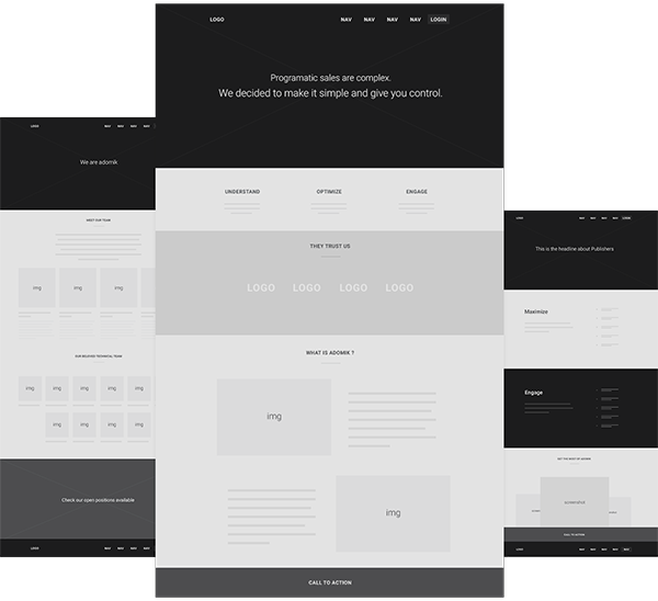
After that, I did some rapid wireframing to adjust the content and copywriting on every page and make sure everything did answer the purpose of the website wich was to present both the product and the company behind it. When it's possible, I like to make rapid wireframing because it helps the client to adjust the content of the website (generally synthesize and refine copywriting to find the right tone for right the purpose).  

Once we've validated the wireframes I’ve applied the visual language on each page and, of course, thought about responsiveness because it’s not even possible to haven’t got a mobile-friendly website nowadays.

FIG #4. QUICK WIREFRAMING FOR THE WEBSITE

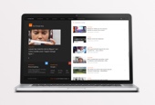
Below you can see some of the final screens