Mission
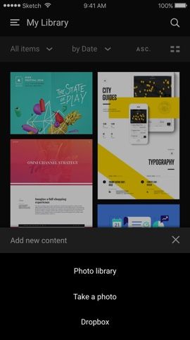
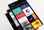
Designing a personal iOS app for Inboard, my favorite tool to create screenshot libraries.

As a designer, I use to do a daily technological and artistic watch, reading articles, tweeting, bookmarking lots of links, saving images, etc. I've quickly realized that I needed a tool to organize all the screenshots that I often take. 


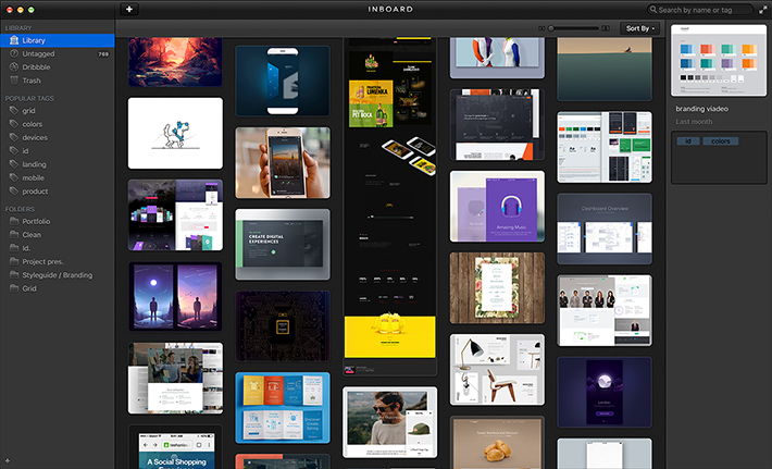
After trying many tools (Gimmebar, Evernote, Kippt, Muse, Zootool, Ember etc.) I've finally focused my attention on Inboard. If you do not know this tool yet, I suggest you take a look on their website. That app lets you create a local screenshots library by drag’n dropping images, adding url, but also with an integrated browser plugin that makes the task easy (full height page or selected area). You can add tags and place your screenshots into folders. You also have access to search and sort features and the ability to share your content. It's pretty basic but very useful. 


I love this tool, but the only thing Inboard lacks is a mobile app. So I tried to imagine what might the Inboard iOS app look like. This project is not a client work, just a personal design exercise, and a lot of fun of course.
CHAP 1.0

Product features

Here is a list of the Inboard Mac app features:

  • Creating screenshot (by url, by drag’n drop, with the browser plugin)

  • Assign tags to a screenshot

  • Move a screenshot into a folder

  • Create / Rename / Delete folders and tags

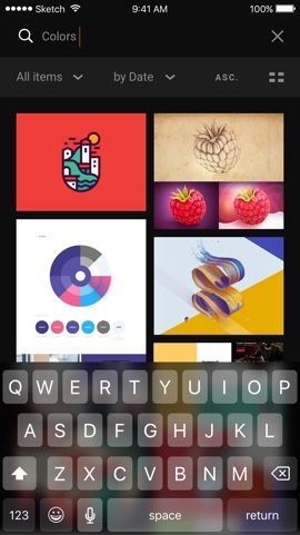
  • Search by tags and title

  • Sort: tags / title + Ascending / Descending

  • Display: by list / by grid

  • Share a screenshot

FIG #1. VISUAL IDENTITY OF THE APP

CHAP 2.0

Mobile design challenges

At first view, none of the features listed above is impossible to turn into a mobile version. But, after few wireframes, I've quickly seen some design challenges that I will explain. Also, like every mobile app, the design have to be touch screen friendly which means large touch area and easy to browse.

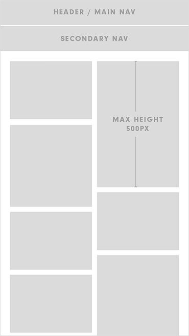
One of the principal design problems is to find a way to navigate and display through different content size, even very high screenshots because you could have full height website page (which means sometimes more than 10.000px height). To solve this, I’ve imagined a flexible grid that could handle different multiple screenshot size.

My design solution

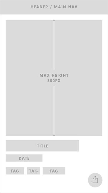
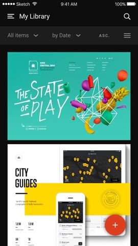
In List view, the thumbnails are 100% width + 800px max height.

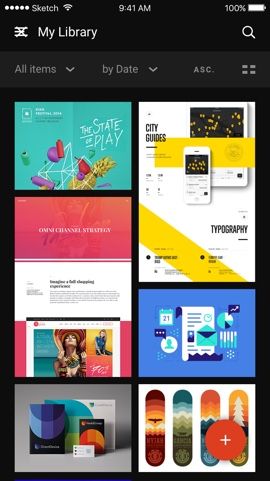
In Grid view, I’d choose to have a two cols grid layout to display more content on each screen. Then, the size of each thumbnail is 100% width and 500px max height. In both cases, the original format ratio of each screenshot is preserve.

Why these numbers?

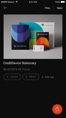
The grid view allows a quick overview of multiple screenshots. Very tall screenshots could easily break the flow with only 2 screenshots on a screen. The max-height solve this issue. The numbers have been chosen with the screen height constraint in mind, in order to keep the title and tags visible on the screenshot page, even with taller one. The user could scroll inside this fixed area, tap to have a full-screen view and tap again to go back.

logo-love

After creating some low-fid static wireframes I quickly start prototyping few interactions to test some ideas and experiment the UX and usability of the app.
I’ve tested lots of prototyping tools but I really like how easy and powerful Principle is. I’m definitely waiting for the Sketch animation features too. 

Here is a low-fidelity prototype (based on the wireframes) that shows how to navigate through the app, change the display (by grid/list) and of course, how to add and edit new content.

FIG. #5   LOW FIDELITY PROTOTYPE

CHAP 3.0

Inboard visual design

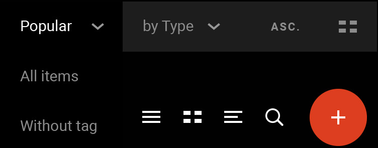
Inboard already has a pretty solid identity based on dark colors and white text to emphasize the focus on content. I’ve kept almost everything but I’ve designed few icons for the mobile app and choose the great Roboto Sans as the main typeface.

FIG #6. UI ELEMENTS / VISUAL LANGUAGE

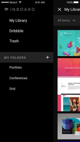
Bellow you could see some screens that include the visual design: 

FIG. #7   FINAL SCREENS

CHAP 4.0

Prototyping interactions

After designing all pages, I wanted to have some fun exploring interaction design. I didn’t go too far on the animation, only some tests for the few core features of the app.

Note: As you may know it, Principle doesn't provide embedded prototypes, so I've uploaded them to Youtube. It means that you can only watch interactions, no play for the moment :/

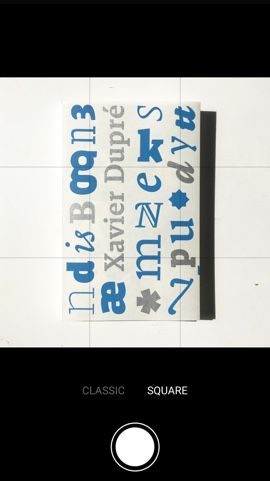
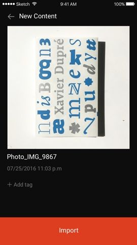
FIG. #9   ADD & EDIT CONTENT

FIG. #11   ADD & DELETE FOLDERS

And to finish, here is a complete Invision prototype with all screens connected. As you could imagine, it’s « just » a Invision prototype so it’s not perfect right ?! 

Note: click on the screen (blue areas) to browse the app.